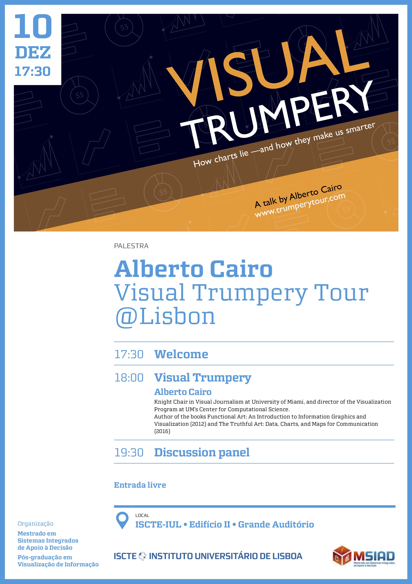
The English word “trumpery” means worthless nonsense, something that is showy and deceitful at the same time. Trumpery can occur in text, verbally, or visually. This non-partisan talk focuses on the visual, examining misleading charts, graphs, and data maps designed by individuals and organizations from all over the political spectrum.
Using examples to equip you with a solid understanding of “graphicacy,” the word used to refer to visual literacy. A literate, numerate, and graphicate citizenry is the best antidote for a world where trumpery runs rampant.
Summary of the talk
Here are the four questions to assess the quality of any data visualization:
- Is the graphic based on reliable sources and data?
Any document or news story that uses data and graphics ought to clearly identify its sources and link to them. You, the reader, must be able to check whether they are trustworthy, and whether writers and designers handled the data properly. - Does the graphic include enough information to be truthful?
Visualizations should never simplify information. They ought to clarify it. You’ll soon understand the dierence, thanks to the examples I’ll share with you.. - Is the data correctly represented?
Data visualization is based on visual encoding. Numbers are mapped onto spatial properties of objects, like their height, length, size, color, etc. When seeing a chart, graph, or map, always ask yourself: Are the properties representing the data proportional to the data itself? - Did the journalist or designer take uncertainty into account?
Data is hardly ever precise or certain, regardless of what visualizations and news stories often suggest. A good understanding of uncertainty and elementary probability can help you decide what to think or how to act based on what you read.
